Product Explainer Video: Drive-Thru Insights
Goal
Create a clear, engaging explainer video for a B2B SaaS product launch across web, LinkedIn ads, trade shows, and lead generation campaigns. The project was completed on a five-week timeline leading up to launch.
Role
Project Manager, Designer, Illustrator, Animator
Led the project from concept through final delivery, managing timelines, stakeholder communication, illustration, animation, and post-production.
Research & Strategy
Worked closely with Product Marketing to understand customer pain points, product positioning, and key features. Developed and refined the script through collaborative review rounds to ensure the messaging stayed clear and focused.

Concepts & Storyboarding
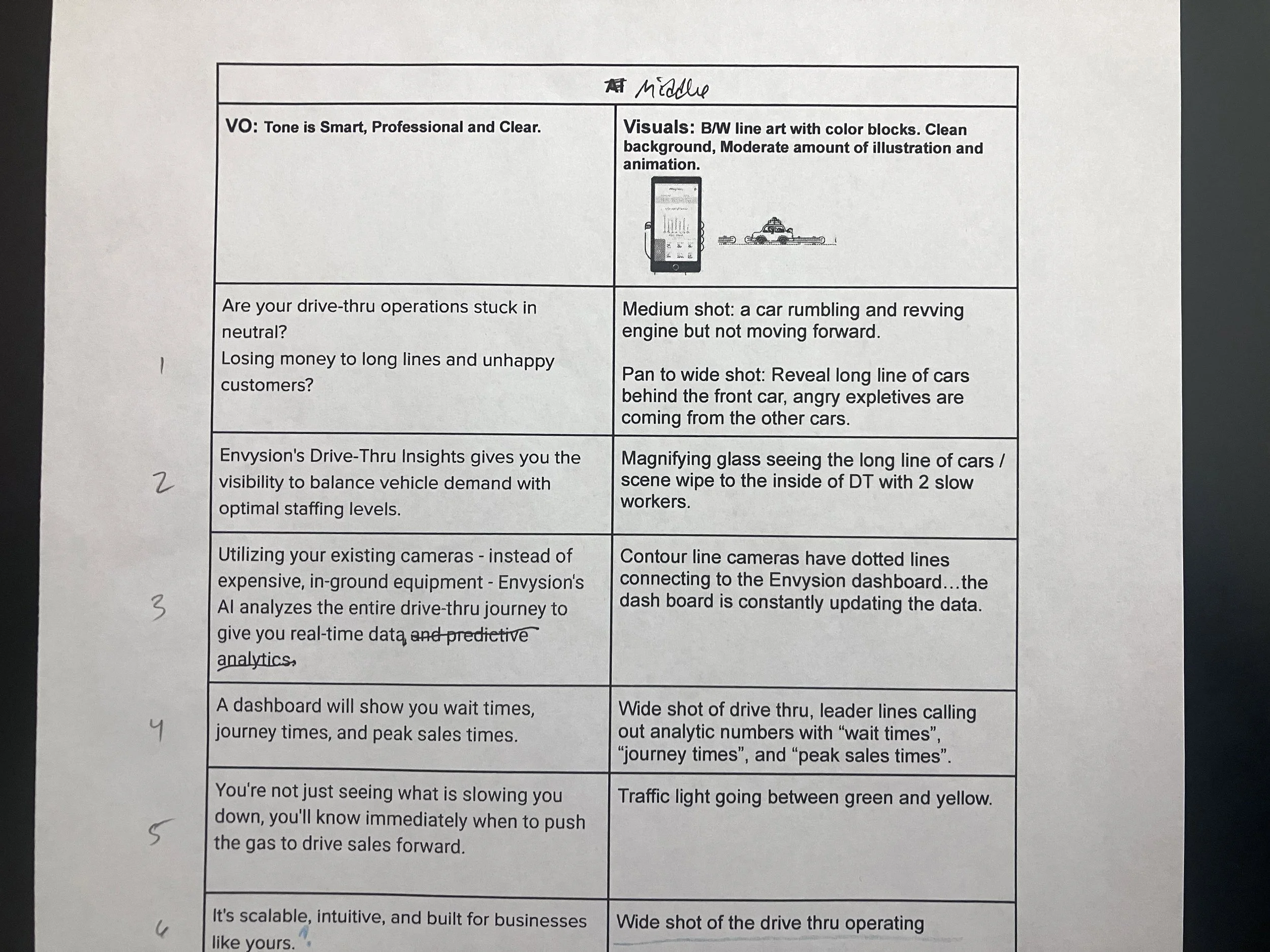
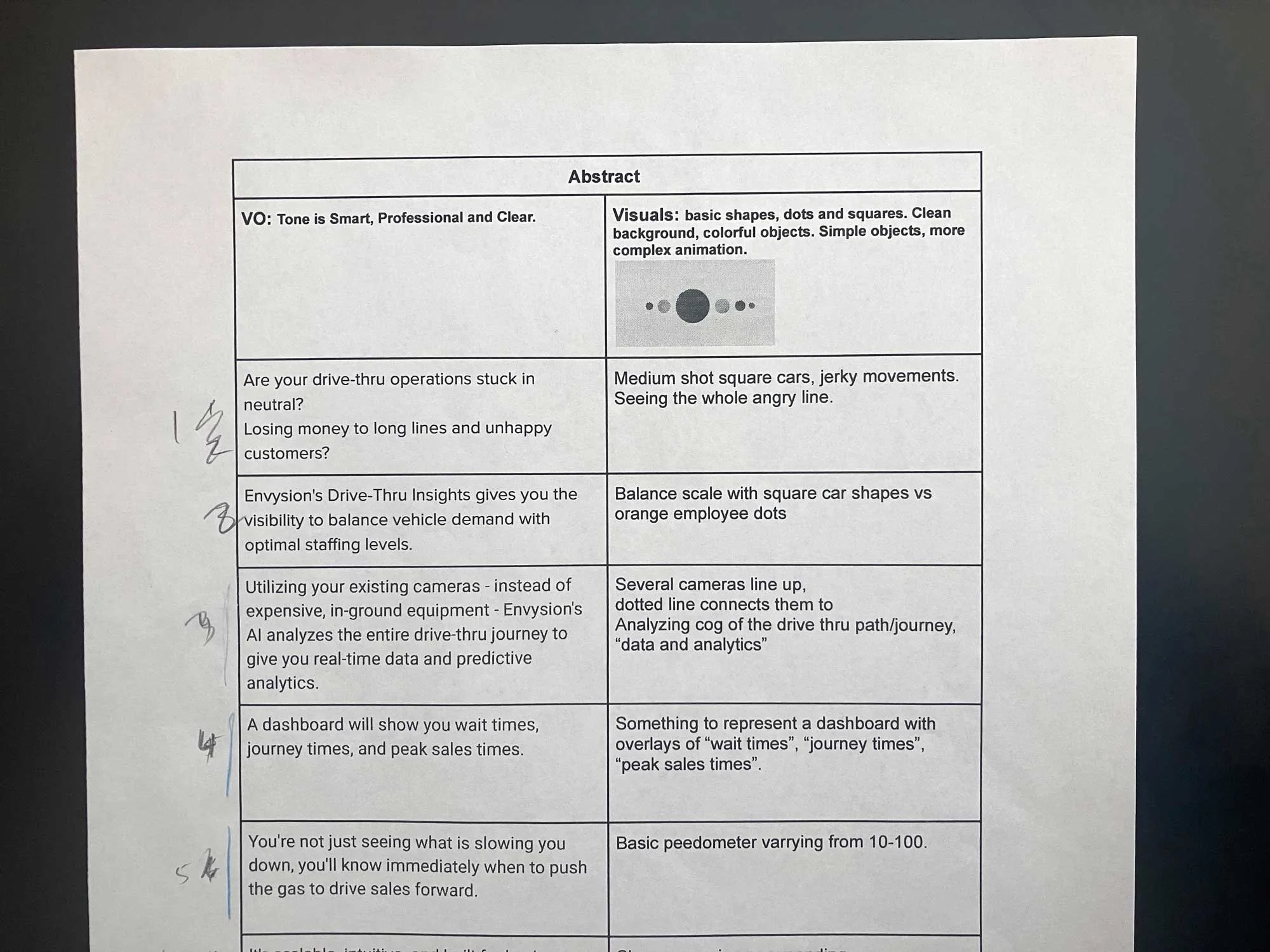
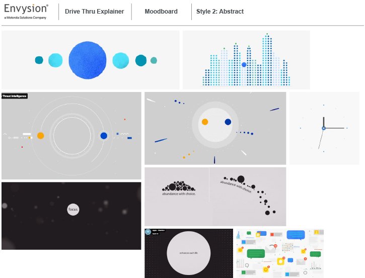
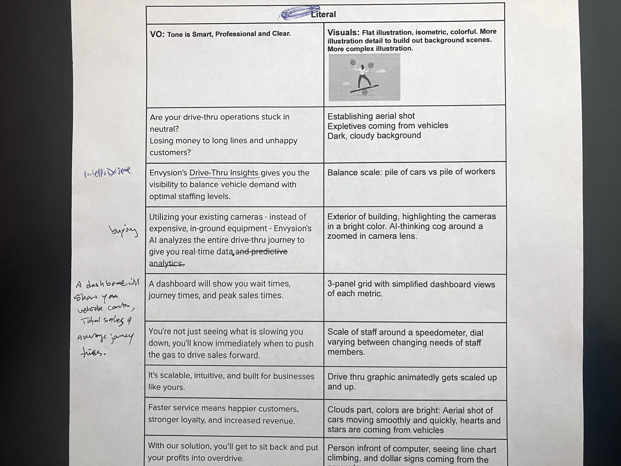
Explored multiple visual directions ranging from abstract to literal storytelling. Presented moodboards, treatments, and storyboard concepts to help the team align on a final creative direction that balanced clarity with personality.


Design & Animation
Created style boards to establish the visual language and animation approach for the piece. Early exploration helped define a cohesive illustration system and revealed opportunities to simplify complex ideas through a custom flat graphic style that would keep the animation process efficient and on schedule.
As the visuals evolved, stakeholder feedback became more focused and collaborative. Early reviews led to refinements in the aerial drive-thru sequence and the final scene to better reflect real-world restaurant operations. Rather than showing an owner sitting at a desk, the final concept placed them outside the restaurant, reinforcing the fast-paced reality of managing multiple locations.
I created a full set of original illustrations for the final style boards, using color intentionally to support the narrative arc of the video. The opening scenes use dark greys and muted tones to establish frustration and operational stress, while an off-yellow palette in the teeter-totter sequence reinforces imbalance and inefficiency. Once the product solution is introduced, the visuals transition to calming blues and brighter colors to signal clarity, control, and positive operational change.


Execution
The first two scenes were designed to feel playful and inviting, with subtle motion details like rolling car wheels to enhance realism and support the overall flow of animation.
The aerial drive-thru sequence focused on clearly demonstrating product functionality, requiring a more literal approach. The vehicle counters presented a technical challenge, so I implemented a timed system with a 30-second threshold to trigger color changes indicating backlog. To ensure consistent pacing and maximize visual clarity, I synchronized and adjusted the timing across all counters so they progressed uniformly.
I used a scratch voiceover to build timing and animation early in the process. Once the script was approved, I brought in a professional voiceover, then integrated final audio, music, and sound design to elevate the piece. While the initial target length was 40 seconds, additional product details were incorporated during review, extending the final cut to 1:00 to fully support the narrative and product explanation.
Outcome
The project was completed on schedule with strong stakeholder alignment throughout production.
My structured project management allowed space for feedback and refinements early in the process, before entering the time-intensive animation phase.
My process for this project was methodical and kept it streamlined. I earned School of Motion’s “Student of the Week” for my styleboards. Focusing on clear communication with visual metaphors helped my work get recognized.